Sarah Esther Williams
Wisdom, Discipline, Courage
Design Exercise 0
A - Bring a picture to Friday’s class that “paints a thousand words.” It can be in any format, but should have the quality that it contains meanings that are not “obvious” to the viewer. This can include culturally situated meanings that may be different for people from different cultures or historical periods.

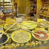
Over the past few months, I have been intrigued by how members of the tourism industry as well as lay people choose to portray the Caribbean in their ads, photo galleries etc. This is a photograph of a creek found in Guyana, a country found in South America but considered to be a part of the Caribbean due to similarities in language , culture and values.
I've found that many persons have mixed reactions to this image whether or not they know that it is an image from a Caribbean location. Some immediately assume that the water is polluted, while others are not so much troubled by the water but by the fact that there are no people in the photo. The latter group feels that this fact adds a sort of silence and stillness to the piece that they find disconcerting.
Persons from Guyana would probably look on this location as a great place to swim. To them, the reddish brown water is clean while a brown color is dirty. Therefore, based on your cultural upbringing and context, one can read this image in multiple ways.
B -Create a graphical logo that in some way represents you. Use this logo as a heading for your webpage.
<See Above Right>
Design Exercise 1 :
Point and Line
For this exercise, we were required to read from Wassily Kandinsky. Though just the reading exercise in itself was quite involved, I became fascinated (and a bit disgusted) but Kandinsky's attention to detail (sound, temperature, applications to nature, music and art etc) in his description of The Point and The Line. More specifically, in rebellion to his individualisation of both elements, I seem more interested in the boundary between the point and the line : where the point loses its form and becomes a line and similarly, when a line begins to function as a point.
I first chose spiraled lines to work with because I thought that it was the most interesting way to merge the point and line. A tiny spiral can easily be interpreted as a point when really it is a line. Quite randomly, I spread spirals of variable sizes across the page.

I then filled in some of the spirals with a jet black color to further push the character of a point.


At this point, I began to place the frame of the piece outside of all the spirals instead of cutting it off. This resulted in a more finished looking composition.

The final product was the following - the above, just flipped!

Another technique that I explored was using tiny straight strokes of varying colors and lengths to create a landscape as follows.
 |
 |
 |
 |
 |
|
Design Exercise 2 : Shape
According to Dondis ...
| Circle | Square | Triangle |
| Endlessness | Honesty | Conflict |
| Protection | Dullness | Action |
| Warmth | Straightness | Tension |
| Workmanlike | ||
| I see these associated meanings represented quite clearly in idioms and clichés accepted by society today for example ... | ||
| the circle of trust | fair and square | A Love Triangle |
| to come full circle | to square away | Bermuda Triangle |
| to go around in circles | to go back to square one | |
| the circle of life | to square your shoulders | |
| I even thought about the shapes of different foods and noticed that the natural shapes of certain foods are circular or cylindrical in nature. For example, Grapes, carrots, oranges etc. Even CAKE! Why aren't square cakes more common? A | ||
I finally settled on the idea of turning certain clichés into visual icons whose meaning could be a recognizable as the sound of the idiomatic phrases themselves. Dondis mentioned that nothing can recognize imbalance faster than he human eye. I chose the explore whether or not the human eye could recognize verbal and written clichés as fast as they would comprehend the phrases.
Of course, these are my interpretations of commonly used idioms and while everyone comes to the same mental meaning, they may not come to the same visual meaning. That said, it would be interesting to see if persons can easily pick out the idioms whenrepresented visually.
| The Circle of Trust |
  |
| Fair and Square |
 |
| To Come Full Circle |    |
| Back to Square One |
   |
Design Exercise 3 :
Color And Value

For the color exercise, I wanted to experiment more with color. The Dondis reading touched on the basic elements of color, how they are placed on the color wheel and emotional associations with color. However, no mention was made of color schemes and the effect they can have on meaning.
According to Johannes Itten who taught at the famous Bauhaus School, there are certain color schemes that are considered harmonious, while others foster discord. A few of these are the monochromatic (using one hue and varying the value or saturation), analogous (using adjacent colors on the color wheel), harmonious triads (uses three colors equally spaced around the color wheel), complementary (using complimentary colors), split complimentary colors(using a color along with the two colors adjacent to its complement), and harmonious tetrads (using colors that, when connected by lines, make a rectangle or a square).
Starting with a black and white abstract design that I designed last semester using gouache paint, I added color and experimented with the different color schemes and looked at the effects that each piece had.
This exercise is hosted as a Google Picasa Album here. The album includes images and descriptions of each design iteration. View the slideshow to begin viewing.
Design Exercise 4 : Ambigrams
This particular exercise took a lot of effort as I sought to not just make an ordinary ambigram but one that had a hidden meaning. I am not quite sure why but doing a piece involving my name seemed like the logical place to start with this exercise.
|
|
|
|
|
|
|
|
|
|


FINAL
Click to Rotate.
Design Exercise 5 : Collage
As with the ambigram exercise, I started this assignment on paper rather than with a graphical text editor. I flipped through magazines and books looking for themes I could work with. I finally landed on a the them of puzzles as I flew to a conference last week. I always carry a PennyPress Variety Puzzle book with me on long flights and thought the theme of puzzles and brain teasers ( crosswords, wordseeks, codewords, hexagrams,Logic puzzles and more) was appropriate for several reasons:
- I've been fascinated by puzzles and brainteasers since early high school and a puzzle collage follows nicely from the Ambigram and logo exercises. Since my interest is so 'old' so to speak, I wanted to give the collage an aged look and feel so I took photo graphs of different puzzles in different lights so as to make the final images more natural.
- As I flipped through the book, I noticed that puzzles are made up of the simplest basic shapes, ie circles, triangles and squares. They also play with positive and negative space in order to make the puzzles more interesting. This observation reminded me of how Dondis associated meaning with shapes and I could really see the circuitous nature of the circle and the tension of the triangle come out in the puzzle solving experience. One can spend hours going in the opposite direction to a puzzle solution.
My Goal for this collage was to make the piece look as natural as possible while giving the reader a slight sense of chaos and nausea (as is often the experience with solving puzzles). The text I included in the collage also reflects certain characteristics of good puzzles and of a good puzzle solver for example, being a sleuth. All of the text comes directly from puzzle titles in the book. The final piece is below (Click for full sized version.). Perhaps you can pick out your favorite puzzles in the collage.

Design Exercise 6 : Abstraction
In Understanding Comics, Scott McCloud charts visual works in a triangle where the corners represent reality, language and the picture plane. The chart thus describes two different kinds of abstraction: from reality towards the realm of language and from reality towards the realm of the pure art object.
For the first two pictures I explored a straightforward progression from an image toward pure abstraction and toward language. However, with the text of my name, I experimented with the notion of showing what the extremes of reality, language and pure abstraction would look like if we started with English letters. I have been drawing loony cartoon faces into my name for as long as I can remember but just realized while putting this exercise together that it could be seen as a cartoonish abstraction of the text of my name and by extension an abstraction of me. Google has made use of the same idea to show their recognition of major holidays and milestones. Example images are shown in the albums below. The results of my work is as follows.
A French Chocolatier - Pure Abstraction
A French Chocolatier - Language Abstraction
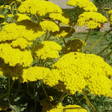
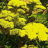
Yellow Flower = Pure Abstraction
Yellow Flower - Language Abstraction
Text Experiment
Design Exercise 7 : Space
My exploration of flat, depth, constrained and open space. Click on the image below.


The Logo I have chosen is displayed above. I found this to be an extremely difficult assignment, creating and discarding 8 prototype logos on the way to settling on the above.
My goal was to somehow convey my multicultural background, multifaceted, complex nature and the fact that I am 'bursting forth' into a new future.
I chose the red brown upward reaching splash element to denote the explosive potential that I possess. The pale gold glow at the center of the logo not only reinforced the idea of infinite potential, but, in my mind unified many different aspects of my history : the gold in the Guyanese Flag (the country where I was born), the Gold in the Bahamian Flag (I lived there for about 5 years), the USC Trojan gold ( my beloved alma mater ), and the gold-ish color sported by Georgia Tech, the school I currently attend.
Therefore the quiet strength of the glow to the unpredictable nature of the splash form an interesting representation of myself... at least for now. :)
About LCC 6311
This class examines two interrelated aspects of visual culture: visual experience and visual communication.
[ Visual experience ] How do we understand and derive meaning from visual images? Theoretical readings, the critical analysis of visual works and class discussions will provide a foundation for students to understand the way in which we experience visual imagery.
[ Visual communication ] What are the basic elements of visual imagery and how can we use them to create images that convey meaning? Weekly design problems and creative exercises will provide the opportunity for students to express themselves visually and to explore in their own way the concepts covered in the readings and class discussions.